Scale vs. Proportion
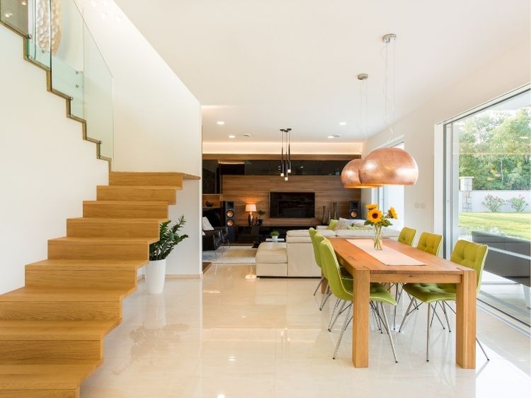
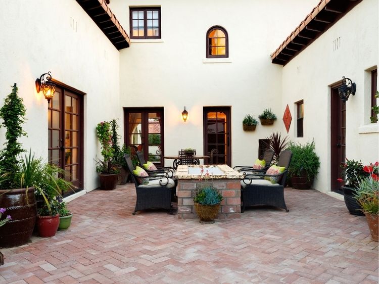
Scale and proportion in interior design do refer to different things. “Scale” tends to refer to how an item relates to the size of the room or to something else – like you! For example, we’ve all seen someone who has crammed an overstuffed sofa into a small living room. Designers would say that the sofa is the wrong scale for the room.
“Proportion” often refers to the shape of an item and how it relates to other things in the room. For example, if you have a square table but place a rectangle dish in the middle of it, the dish probably won’t look right because it won’t be the correct proportion for the table.
To avoid confusion, we’re going to use these terms the way most decorators do – interchangeably. Whether referring to scale or proportion, just remember that it’s how design elements relate to each other in a space.
How to Create the Correct Scale and Proportion
Below are some tips for creating the correct scale and proportion in your room or home. Remember that these are general rules, and well, some rules are made to be broken. If you are new to decorating your home, follow the rules. More experienced decorators or those who “just have an eye for these things” may want to branch out a bit.
- Size: A larger room can handle furnishings and decor that are larger in scale and vice versa. The smaller the room is, the more petite or delicate the furnishings and decor should be.
- Furnishings: The main furnishing item in the room sets the stage for the scale of all the other furnishings. For example, an overstuffed sofa and a delicate side table may look silly next to each other.
- Height: The higher the ceiling, the taller and more imposing the furnishings pieces can be. Low ceilings beg for low furniture and decor. The one exception to this rule is using low, modern furnishings in a room with tall ceilings to achieve a dramatic effect.
- White space: Remember to leave “white space” in a room. This is the space around and above furniture. A room rarely looks good when every square inch of it is filled. The eye needs room to rest in a space, so provide it by leaving some surfaces uncovered and some walls alone.
- Patterns: If the room is small, keep patterns to scale. Use smaller prints and less of them. A larger room can typically handle larger prints and more colors. If you have a small room but prefer a larger print, make sure it has lots of white space in it and use it sparingly.
- Repetition: Use repetitive patterns or colors. For example, if you have square-shaped wainscoting panels on your wall, choose a square coffee table to maintain the same proportions throughout the room. Just be careful not to overdo it.
Take a good, long walk throughout the rooms of your home. If something doesn’t feel right, it probably doesn’t have the correct scale or proportion for the space. Rearrange it, remove it or replace it until you achieve the room – and the home – that you desire.


